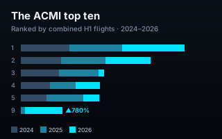
Ranked by combined flights across the first halves of 2024, 2025 and 2026, the wet-lease market's ten busiest customers tell two stories at once: an untouchable leader, and two brands of the same airline group heading in opposite directions at speed.
ACMI — wet-leasing, where one airline flies aircraft, crew, maintenance and insurance on another's behalf — is where carriers quietly buy and shed capacity. Rank the busiest customers by the flights they had operated on their behalf, and you get a leaderboard that doubles as a map of who is expanding and who is retreating.
Top 10 ACMI customers by combined H1 flights, 2024–2026 — each bar split by year. Open the interactive version → Source: ch-aviation.
SAS is running away with it
Scandinavia's SAS sits at the top with 91,509 flights across the three periods — and unlike almost everyone below it, it's still growing: up another 19% into 2026. Swiss holds a steady second on 64,518. The gap between first and second is the widest on the board, and it's getting wider. In a market where most customers are volatile, the leader's stability is itself the story.
Same group, opposite directions
Look at rank three and rank nine together. Qantas mainline was a fixture near the top — then its 2026 ACMI flying fell off a cliff, down 87% to just 2,660 flights. Read that alone and you'd conclude the group pulled back hard from wet-leasing.
But drop to rank nine and there's QantasLink — the group's regional brand — up 780% to 18,951 flights, having barely registered in the data a year earlier. Add the two together and the Qantas Group's combined ACMI flying went 19,107 → 22,080 → 21,611: essentially flat, even as its two brands swung violently in opposite directions. Why? The flight counts alone don't say — contracts, operators and routes sit outside this dataset, so we won't pretend otherwise. What the data does show is a contrast that vanishes if you track a single brand and only appears when you hold the whole group in view.
Churn beneath the surface
The rest of the top ten is turbulence. IndiGo and KLM both roughly halved their 2026 wet-lease flying (−56% each). Viva of Mexico appeared from nowhere in 2025, then gave most of it back. SpiceJet swung the other way, up 126%. EAT Leipzig — DHL's cargo workhorse — is the quiet metronome, barely moving across three years. Wet-lease demand is where airlines make their fastest capacity decisions, and it shows.
Why the chart is built the way it is
The customers were selected on one metric — combined flights across the three half-years — so the chart makes that metric the bar itself: length is the ranking, sorted top to bottom. Each bar is split by year and shaded oldest-to-newest, which is why Qantas reads as a bar of mostly "old" flying with a bright sliver of 2026, and QantasLink as almost entirely brand-new. A momentum figure beside each rank carries the latest move. Every number is computed from the underlying data; nothing is typed in by hand.
What your data needs to look like
One row per entity, then one value column for each period you're comparing — two or three periods works best.
customer
h1_2024
h1_2025
h1_2026
SAS
29,300
32,100
34,841
QantasLink
2,160
10,400
18,951
Novice tip: don't rank the rows yourself or add a totals column — the agent sorts by the combined total and computes each entity's momentum. Just give it the raw counts per period.
Have a ranked dataset with a story moving underneath the totals? Drop it into the AK.VIZ agent for three chart proposals on your real numbers, or see more of the work.