A CSV goes in. What comes out is the kind of graphic that usually needs a specialist and a fortnight. Here is every step, with real screens — and two real datasets drawn the way most tools would draw them, next to ours.
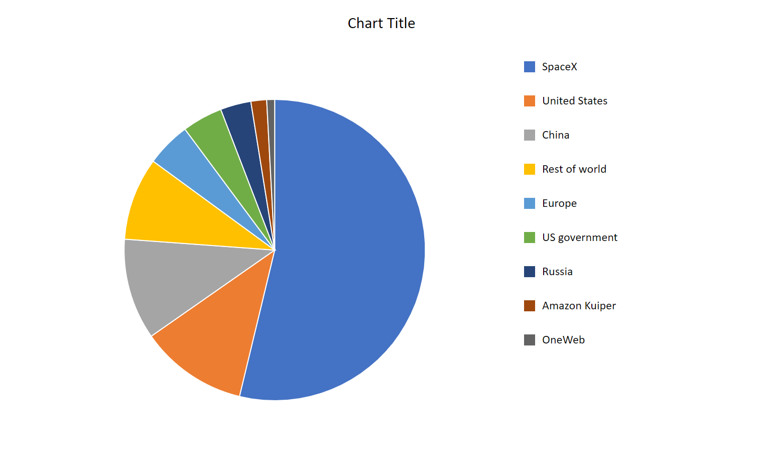
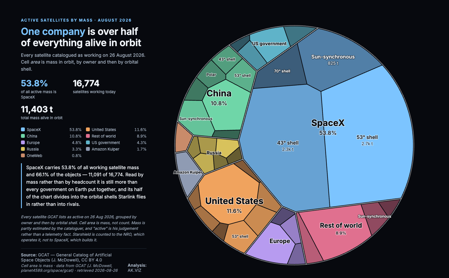
This is a real dataset from the portfolio — every satellite catalogued as working, 11,403 tonnes of it, grouped by owner and then by the orbital shell each one flies in. Two levels of hierarchy. Here is what happens to it.


The boundary in the live version morphs between five outlines — circle, scalloped, hexagon, pentagon, squircle — re-tessellating on identical data each time, which is a fast way to show that area carries the number and shape does not. The write-up covers the solver setting that decides whether it is honest →
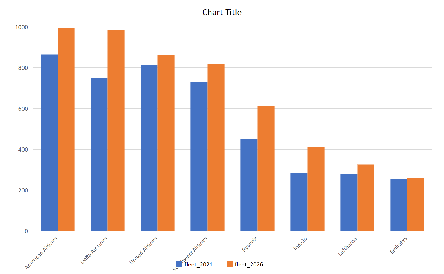
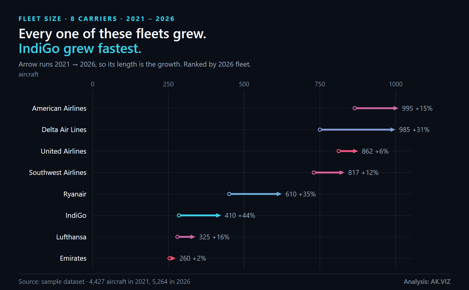
Not every dataset is a hierarchy. This is the sample built into the agent — eight airlines, a fleet count for 2021 and one for 2026. Every number in the right-hand chart also appears in the left-hand one.


A board does not need telling American Airlines has 995 aircraft. It needs to see that IndiGo grew 44% while Emirates grew 2%. One of those charts puts that on the page; the other leaves it as homework.
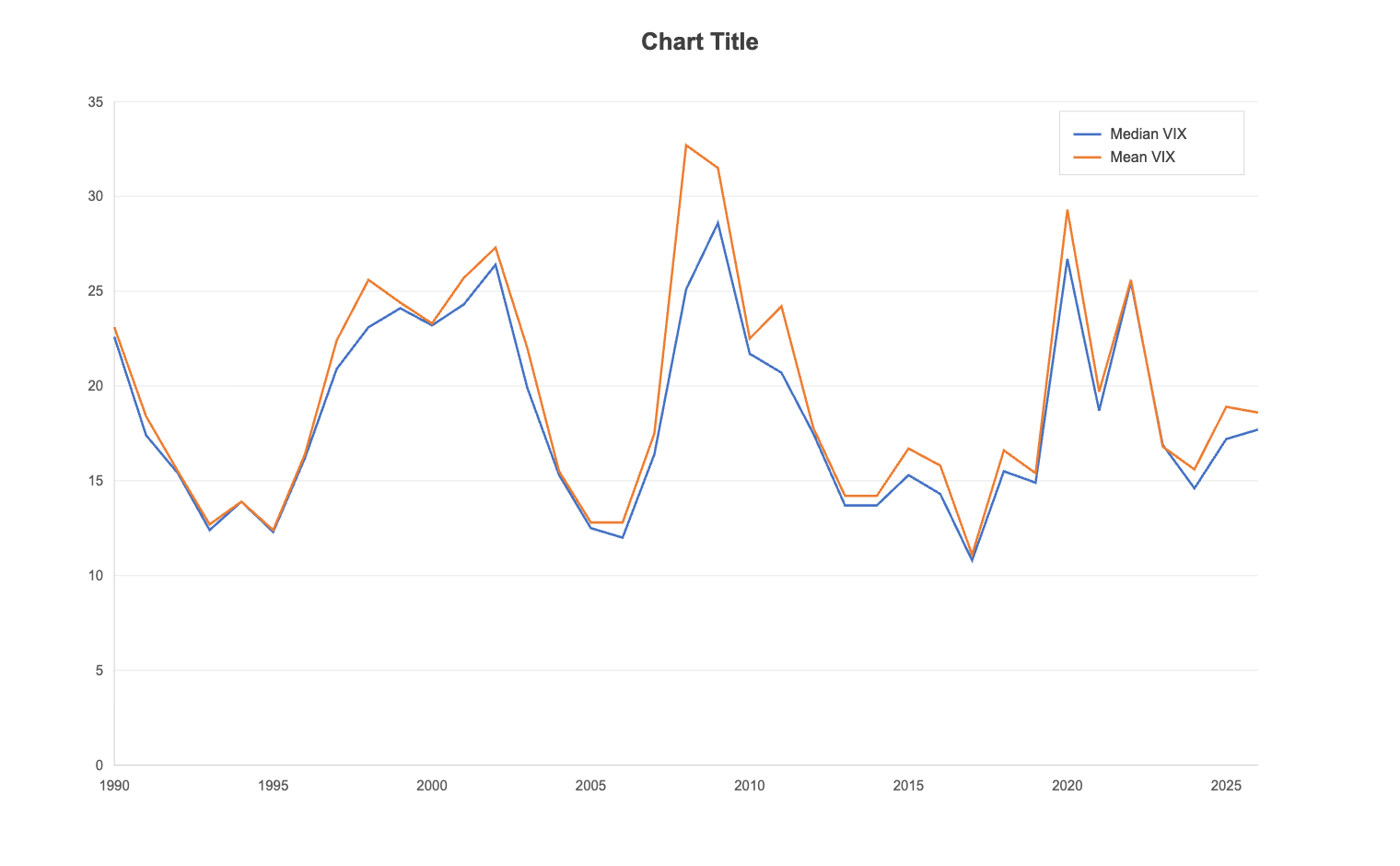
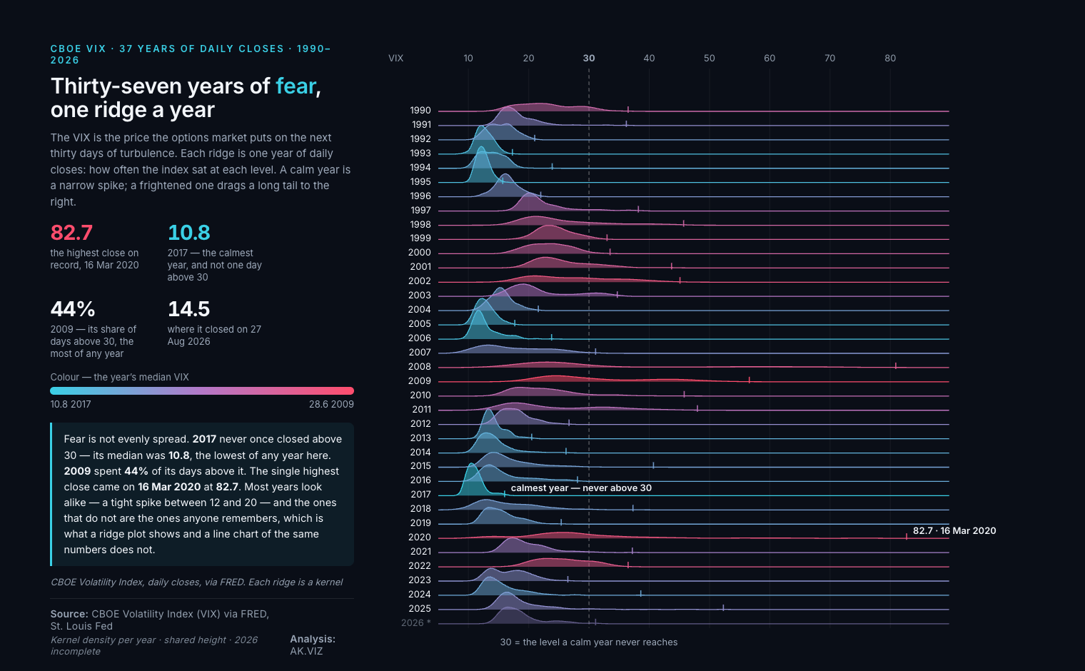
The VIX is the price the options market puts on the next thirty days of turbulence. One value a day since 1990 — about 9,300 numbers. The usual way to fit that on a page is to average each year down to a single point.


The line chart puts 2020 at a median of 26.7, a touch above 2008. The ridge shows what that average hides: a tail reaching 82.7 on 16 March 2020, the highest close on record. It also shows the opposite — 2017 never closed above 30 once, while 2009 spent 44% of its days there. Same numbers, and only one of the two charts contains that sentence.
Four steps. The screens below are the real interface, not mock-ups.
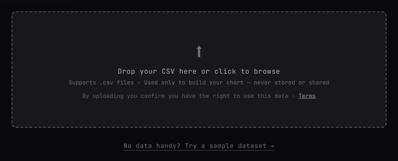
Drag a file in, or click Try a sample dataset if you just want to see it move. No account, no card, and the file is used to build your chart — never stored or shared.

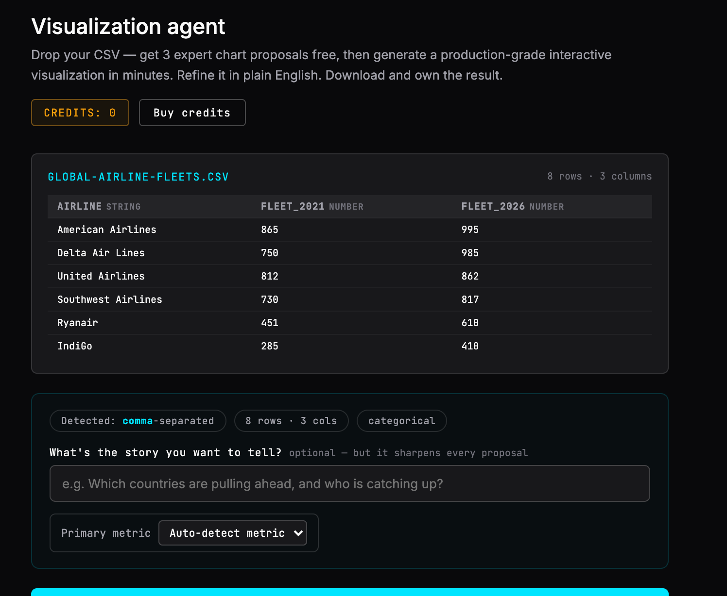
Delimiter, row count, column names and the type of every column — detected on load. Here it has found 8 rows, 3 columns, one text field and two numeric ones, and offered a box for the story you want to tell. Messy government exports with stacked headers are handled the same way.

Not a gallery of chart types to browse — three specific recommendations for this dataset, each saying what it would argue and why that form suits your data. Free, before you pay for anything. If the data cannot support the chart you had in mind, that is where you find out.
A production-grade interactive chart in minutes. Adjust it by asking. Then take it away as a 1080×1350 PNG, a presentation PDF, interactive HTML, an embed snippet, or an editable SVG your designer can open in Illustrator.
A short screen recording of the full run, from empty drop zone to downloaded file.
The steps above are the real interface and the comparison above is real output, so nothing here is waiting on the film. Run the agent yourself →
Three things a template picker cannot do, and they are the reason the right-hand chart above looks like that.
The agent picks a chart form for what your data is doing, not for what column types you happen to have. A tool that maps "two numeric columns" to "grouped bar" will give you a grouped bar every time, whatever the story.
“IndiGo grew fastest” is derived from your file at render time, along with the totals and every percentage. Refresh the data and the sentence moves with it. Nothing is typed in by hand to go stale.
Overlapping labels, contrast in every theme, type below the legible floor, the export canvas. A chart that fails does not go out — and if your data has a break or a coverage gap in it, you are told before anything is drawn.
Two worked examples of that last point, written up in full: a statistical break that would have printed a 24% fall that never happened, and a solver setting that drew the smallest cells 246% too large.
Three chart proposals on your own numbers, free, no card needed.