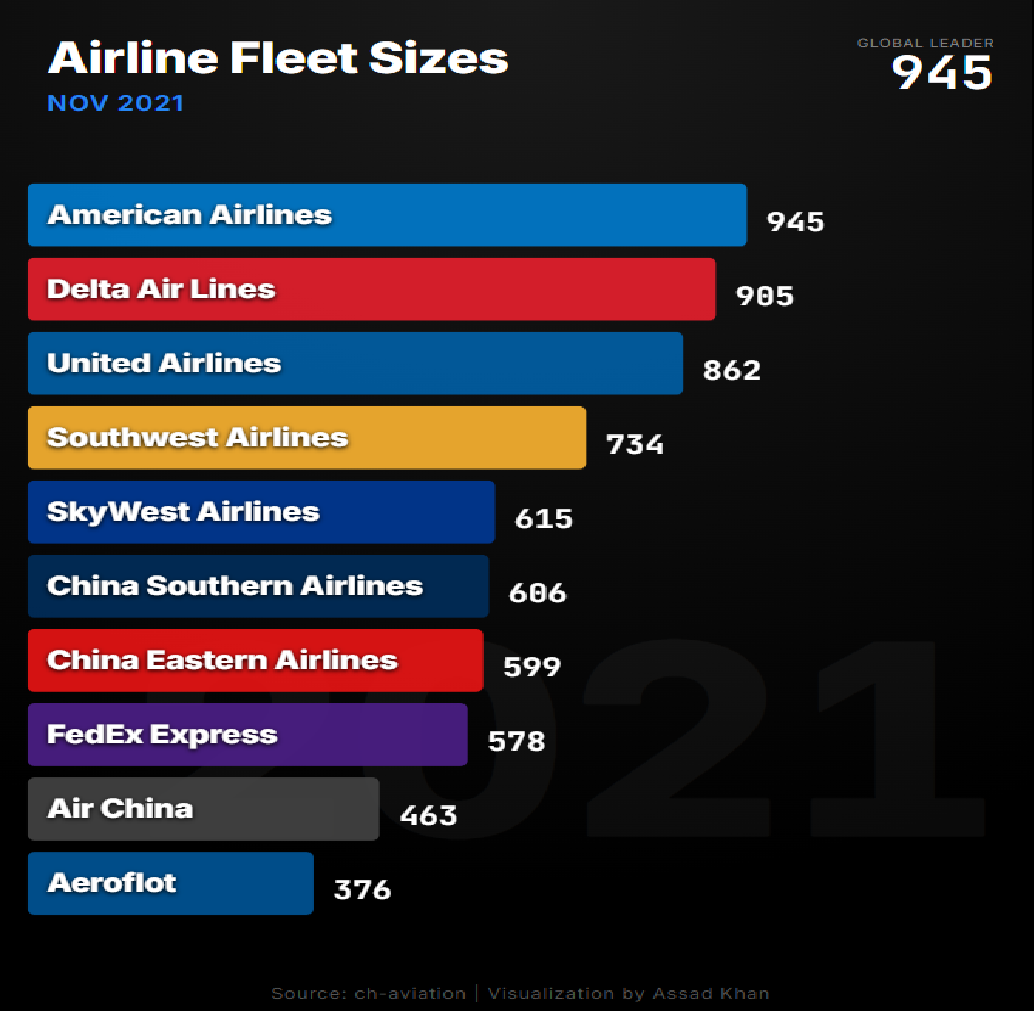
The fleet race: how United took the crown in five years
In January 2021, American Airlines had the world's largest fleet — 933 aircraft, with United third at 827. By January 2026 the podium had fully inverted: United 1,069, Delta 1,047, American 1,034. Month by month, the race tells you who actually executed.
Fleet size is a blunt metric — it says nothing about seats, utilisation or profit. But change in fleet size is one of the most honest signals in the industry, because growing a fleet requires everything to work at once: deliveries arriving, financing closing, pilots trained, demand real. Track the top operators monthly for five years and you get a documentary of the post-pandemic era.
The five-year deltas at the top are stark. United added 242 aircraft (+29%), from 827 to 1,069 — the "United Next" order book turning into metal. Delta added 197 (+23%) to reach 1,047. American, the 2021 leader, added 101 (+11%) — still growth, but half United's pace, and enough to fall from first to third. In a race chart you can watch the exact months the lines cross.
The stories in the midfield
Aeroflot is the race's one shrinking giant: 400 aircraft in January 2021, 343 by January 2026, as sanctions cut it off from Western deliveries and support. FedEx slimmed from 562 to 466 — not distress but a deliberate freighter drawdown as the pandemic cargo boom normalised. Meanwhile China Eastern (711) overtook China Southern (674) to become China's largest fleet, and the fastest riser in the field is IndiGo — from 287 aircraft to 438, up more than 50%, the same airline taking one Airbus a week in the 2025 delivery map.
Why the chart is built the way it is
Ranking data over time forces a choice: a bump chart shows the rank story cleanly (see the life-expectancy version), while a bar-chart race keeps the magnitudes — you see not just that United passed American, but by how many airframes, month by month. Because the values update monthly, the animation is honest: no interpolated drama, every frame is a real snapshot. Pause it anywhere and the bars are a true league table for that month, with full airline names and exact counts on every bar.
What your data needs to look like
One row per entity, then one column per year (wide), or entity / year / value rows (long) — either works.
airline
2015
2016
2017
American
963
971
968
United
827
861
901
Novice tip: bring the absolute count in each year, not the rank — the agent derives the ordering, the movement and who overtakes whom. You never sort or pre-compute positions yourself.
The takeaway
Five years of monthly fleet counts compress the whole era into one animation: America's big three swapping places as order books executed at different speeds, Russia's flag carrier shrinking in isolation, cargo normalising, and India arriving. Fleet size isn't the whole story of an airline — but the race is the story of the industry.
For the deeper story behind United's rise — what those 1,000+ aircraft are, and the 638 more on order — read the United fleet-plan analysis. Or drop your own time-series into the AK.VIZ agent and get three chart proposals on your real numbers.