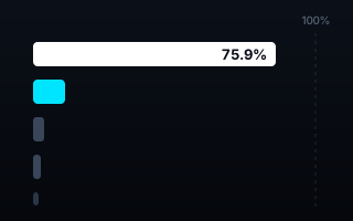
One country mines three-quarters of the world's cobalt
The US Geological Survey's 2024 estimate puts the Democratic Republic of the Congo at 220,000 tonnes of mined cobalt — 75.9% of everything the world pulled out of the ground. Every other producer on Earth, combined, accounts for 13.9%.
Cobalt sits inside most lithium-ion batteries, which puts it inside most electric vehicles, laptops and grid-storage racks. So the question of where it comes from is really a question about how concentrated the supply side of the energy transition is. The USGS answer, in its Mineral Commodity Summaries 2025: extraordinarily concentrated.
The numbers, straight from the survey
World mine production in 2024 was an estimated 290,000 tonnes of cobalt content. DR Congo produced 220,000 t — 75.9%. Indonesia, the fastest riser, produced 28,000 t (9.7%), up 47% on its 2023 figure of 19,000 t. Then the cliff: Russia at 8,700 t is third with 3.0%, and the remaining named producers — Canada, the Philippines, Australia, Cuba, Papua New Guinea, Türkiye, Madagascar, New Caledonia, the United States — each hold roughly one percent or less.
Mined cobalt by country, 2024 estimate. Open the interactive version → Source: USGS Mineral Commodity Summaries 2025 (public domain).
The reserves view re-ranks the world
Toggle the chart to reserves and the story shifts rather than softens. DR Congo holds 6 of the world's 11 million tonnes of identified reserves — 54.5%. But second place changes hands entirely: Australia, seventh in 2024 production at just 3,600 t, holds the world's second-largest reserves at 1.7 million t. Today's mining map and tomorrow's are not the same map — though both run through the same first name.
Why the chart is built the way it is
The bars sit on an axis that runs to 100% of world output — not to the biggest value, as ranking charts usually do. That single decision is the chart: DR Congo's bar literally fills three-quarters of the frame, and no annotation has to tell you it dominates. A bracket gathers the long tail into one honest phrase ("every other producer combined: 13.9%"), the hero share is printed inside the bar, and the production ↔ reserves toggle re-ranks the same bars so Australia's leap is something you watch happen. Both the PNG and the SVG export come from a single clean vector poster, so the downloaded file is genuinely editable.
What the data made us check
Honest charts audit their inputs. Four things worth knowing sit in the footnotes: every figure is a USGS estimate; the world total is rounded (country figures sum to 288,200 t against the published 290,000 t); New Caledonia's reserves carry no USGS estimate at all — the chart says "no estimate" rather than drawing a zero-length bar; and the USGS lists DR Congo as "Congo (Kinshasa)" and Türkiye as "Turkey". Production here means cobalt content of mined ore — refining is a different, separately concentrated story this dataset doesn't cover.
What your data needs to look like
One row per entity, one value column, plus the published total that serves as the denominator. An optional second metric unlocks the re-ranking toggle.
country
production_t
reserves_t
DR Congo
220000
6000000
Indonesia
28000
640000
Russia
8700
250000
Novice tip: bring the raw levels, not the percentages — shares are computed against the published world total, so the leader's bar length and the tail bracket always agree with the source. If a value is genuinely unknown, leave the cell empty rather than writing zero; the chart will say "no estimate" instead of drawing a lie.
The takeaway
Supply-chain risk is usually described in adjectives. This is one number: 75.9%. Whether you read the production view or the reserves view, the world's cobalt runs through one country — and a chart whose axis is the whole world makes that impossible to miss.
Have a market-share or concentration dataset of your own? Drop it into the AK.VIZ agent for three chart proposals on your real numbers, see more of the work, or read about bespoke commissions.