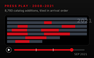
Take every dated addition to the Netflix catalog — 8,793 of them, 2008 to September 2021 — lay each one down as a tile in the order it arrived, and the wall's texture tells you the strategy without a single axis.
The Kaggle "Netflix Movies and TV Shows" dataset may be the most-charted file on the internet: thousands of bar charts of genres, pies of ratings, dashboards of everything. All of them treat it as a spreadsheet. We treated it as what it actually is — a chronology. Every row carries the date Netflix put that title on the shelf, which means the catalog can be replayed, in order, like footage.
So the chart is a player. The red bar scrubs from 2008 to September 2021 (where this snapshot freezes — it's a period piece, not current Netflix). Press play and the shelf stacks itself: graphite tiles are films, red tiles are TV. No axes, no legend gymnastics — arrival order does all the work.
The decade player — press play, or drag the bar. Open the interactive version → Source: Kaggle, catalog snapshot to Sep 2021.
What the texture shows
The empty years. From 2008 through 2014 the wall barely exists — 56 titles in seven years. Streaming was a side project bolted to a DVD business; the catalog was licensed, thin and old.
2016, the explosion. 429 additions in one year — five times the year before. From here the wall builds in visible sheets: 1,188 in 2017, 1,649 in 2018.
2019, peak shelf. 2,014 titles added in a single year — the densest stripe on the wall. The median addition was one year old on arrival: by now Netflix wasn't archiving the past, it was premiering the present.
2020, the bend. 1,879 additions — the first down year of the streaming era. The 2021 rows thin further (1,498 by September, where the data ends). The dataset doesn't say why, and neither do we — it only says the pace bent.
Three numbers hiding in the wall
30.3% TV. The pop story says Netflix became a TV company — but additions stayed two-thirds film all decade. What changed is the red tiles' persistence: the TV share of additions climbs through the wall's lower half without ever taking it over.
59.8% non-US. Of titles listing a country, America is a minority: by the snapshot, roughly six of ten additions came from somewhere else — India alone contributed over a thousand titles.
One year old. The median age of an addition from 2016 onward. Half of everything Netflix shelved arrived within a year of release.
Why the chart is built the way it is
The scrubber is the most-understood interface element in streaming — nobody needs it explained, which makes it free to carry data. Chapter markers pin the three era shifts; the counters read the catalog as of the playhead and settle on exact computed values, never rounded interpolants. The wall is a canvas of 8,793 individually placed tiles, so hovering any region reads that month's numbers. And the housekeeping is disclosed on the chart itself: 10 undated titles excluded, 4 duplicates dropped, 3 misfiled ratings repaired, 2021 marked partial.
What your data needs to look like
One row per item, carrying the date it arrived and a category to colour it by. Any dated list works — orders, hires, sign-ups, incidents.
title
date_added
type
Example One
2019-03-12
Movie
Example Two
2021-08-04
TV Show
Novice tip: don't group by month or year first — hand over the raw dated rows and the agent orders, tiles and counts them into the running totals. The arrival date is the one column that's non-negotiable.
The takeaway
Time-stamped catalogs don't need dashboards — they need playback. Any dataset with an arrival date is footage waiting to be scrubbed: orders, fleet deliveries, hires, funding rounds. This piece is the template.