Half of humanity lives in seven countries
There are 8.16 billion of us in 2024. Line up the countries by population and it takes only seven — India, China, the United States, Indonesia, Pakistan, Nigeria and Brazil — to account for more than half.
There are 8.16 billion of us in 2024. Line up the countries by population and it takes only seven — India, China, the United States, Indonesia, Pakistan, Nigeria and Brazil — to account for more than half.
Population is the most lopsided distribution in world statistics, and lists bury the lopsidedness — "India 1.45 billion, China 1.42 billion, United States 345 million…" reads as a ranking, not a shape. A treemap makes the shape physical: each country is a rectangle whose area is its population, so the two giants aren't just top of a list — they're most of the picture.
India (17.8% of humanity) and China (17.4%) alone are 35.2% of everyone. Add the United States (4.2%), Indonesia (3.5%), Pakistan (3.1%), Nigeria (2.9%) and Brazil (2.6%) and you cross 51.4% at country number seven. On the chart those seven carry a bright halo, so you can see the exact tiles that hold half the species.
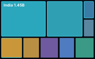
Group the tiles into regions and one continent dominates: Asia is 58.9% of humanity — nearly three in five people. Africa is 18.6% and, crucially, the only region still growing quickly; Europe is 9.1%, North America 7.5%, South America 5.3%, and all of Oceania is 0.6%. The twenty-first century's demographic story is written in the gap between the Asian giants that are plateauing and an African bloc that is not.
A treemap earns its place only when magnitudes span orders of magnitude — and populations run from 1.45 billion to a few thousand, so they do. Countries with at least 20 million people are named in their own tile; the long tail of smaller nations folds into one honest "Other [region]" tile per continent, italicised, rather than shattering the chart into 230 unreadable slivers. Big tiles get a name and a number, medium tiles get the country's ISO code, and tiles too small to label cleanly get nothing rather than a smudge — every label stays readable at 100%. Regions are outlined and labelled with their share, and the seven "half" countries carry the accent halo so the headline survives inside the graphic.
The first thing a treemap owes you is that the parts add up — so we checked. And the first pass didn't: the 233 countries summed to 8.13 billion against the UN's 8.16 billion world total, a 0.38% hole. The culprit was punctuation. The UN files a few places with commas inside their names — "China, Taiwan Province of China", "China, Hong Kong SAR", "China, Macao SAR" — and a naive comma-split shredded those rows, quietly dropping about 31 million people, Taiwan among them. A quote-aware parser put them back and closed the gap to 0.000%. Two framing notes stated on the chart: figures are the UN's medium-variant estimate for mid-2024, and regions are UN continents.
One row per entity, its value, and the group it belongs to. The agent builds the nesting and sizes every tile.
| country | region | population |
|---|---|---|
| India | Asia | 1450936 |
| Nigeria | Africa | 232679 |
| Brazil | South America | 211999 |
Novice tip: bring raw counts, not percentages — a treemap sizes tiles by the value, and it checks that your group totals sum to your grand total before drawing. If a few entities are tiny, don't drop them: label a "fold small into Other" threshold and the chart keeps them honestly counted instead of silently missing.
"8 billion people" is a number too big to feel. Seven rectangles holding half of it is not. The concentration is the story — and the countries in those seven tiles are where the century's questions about work, ageing, migration and growth will mostly be answered.
Have a magnitude-and-group story in your numbers? Drop it into the AK.VIZ agent for three chart proposals, see more of the work, or read about bespoke commissions.